Queens’ Suite 2018
Logo Development Process Overview
This logo project for a video production company comprising all-female partners provided a fun opportunity to explore several angles that I enjoy: they wanted something iconic, were open to it being heavily illustrated, and possibly with an Art Nouveau or Art Deco influence.
“We’re so glad we had the chance to collaborate with Abe and put his skills to work with such incredible results!”
Laura Annalora, Queens’ Suite
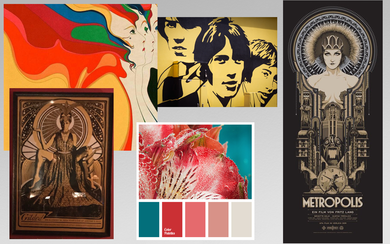
As is typically the case, this project got underway with the creation of a “mood board,” an assemblage of images and color schemes which were points of inspiration for the client.
As the mood board and subsequent conversations with the client began to generate ideas, I recorded them as rough sketches. Typically, my work at this stage is done to aid my own memory more than anything else, and so initial sketches such as these are hastily executed and often crude to the point that anyone other than myself would likely require extenseive explantion before they could grasp exactly what was intended.
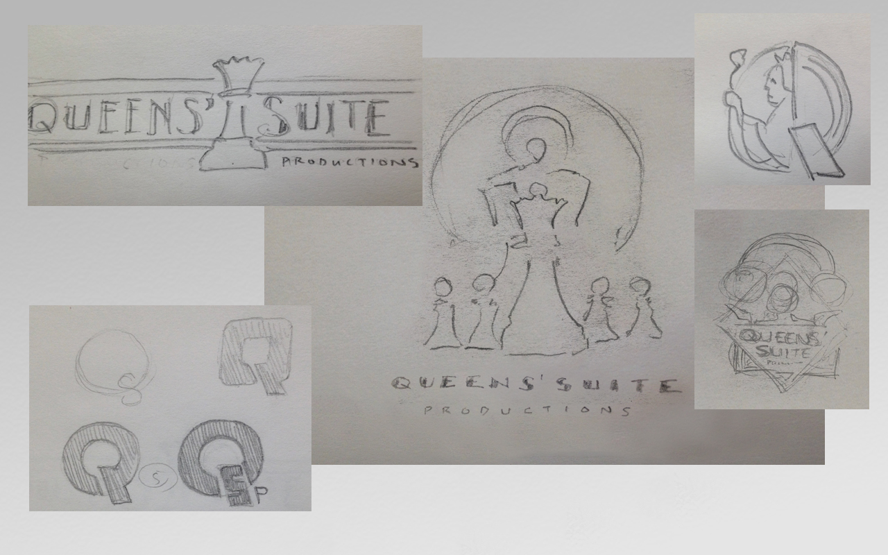
Those ideas which were deemed worthy to run by the client required further refinement. These subsequent comps employed a mixed media approach of pencil sketches combined with digital elements (typography or other features that could be more quickly and accurately rendered digitally than by hand). In some cases, a down-and-dirty Photoshop assemblage was created to represent an idea that, in the final version, would be rendered out by other means (whether digitally or via more traditional media – or often a combination of both techniques), as was the case with the vertical example at below right.
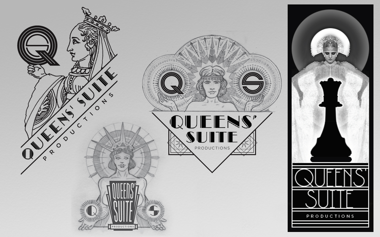
Further development of the “chess piece” theme.
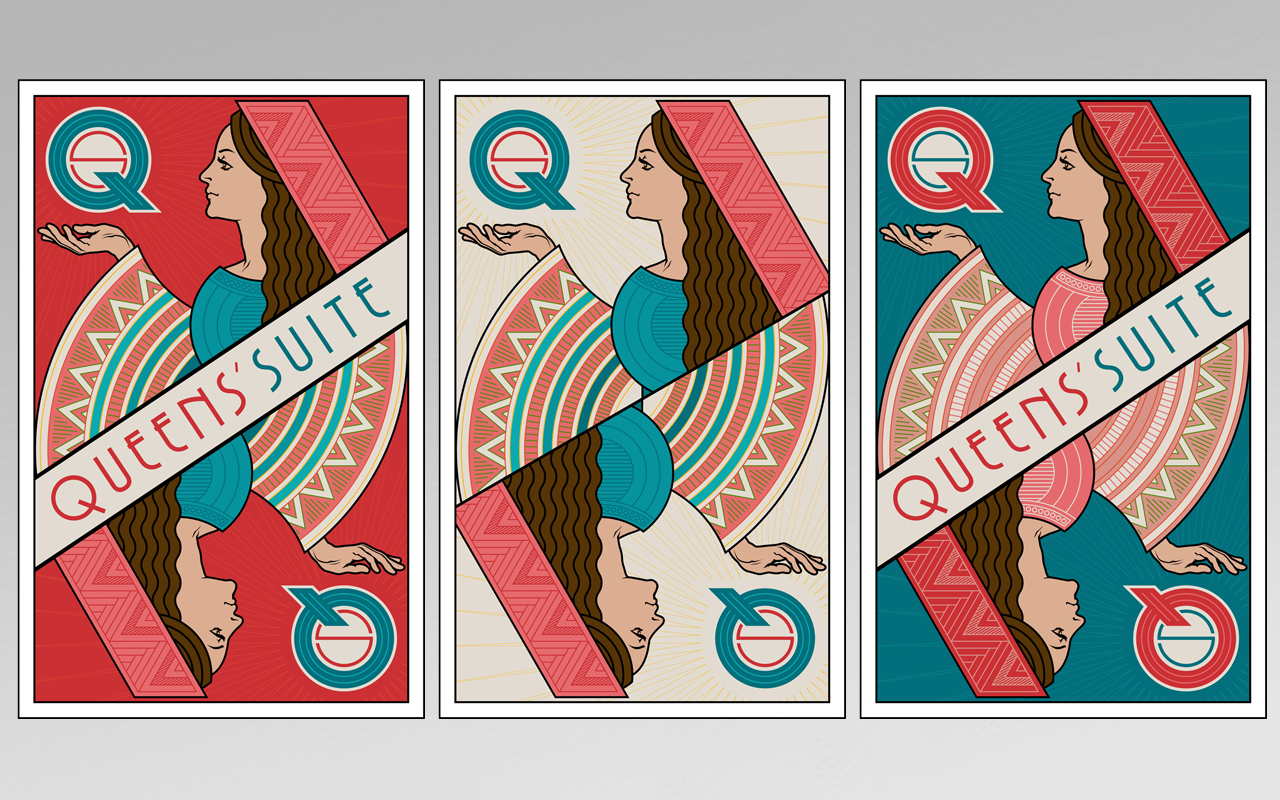
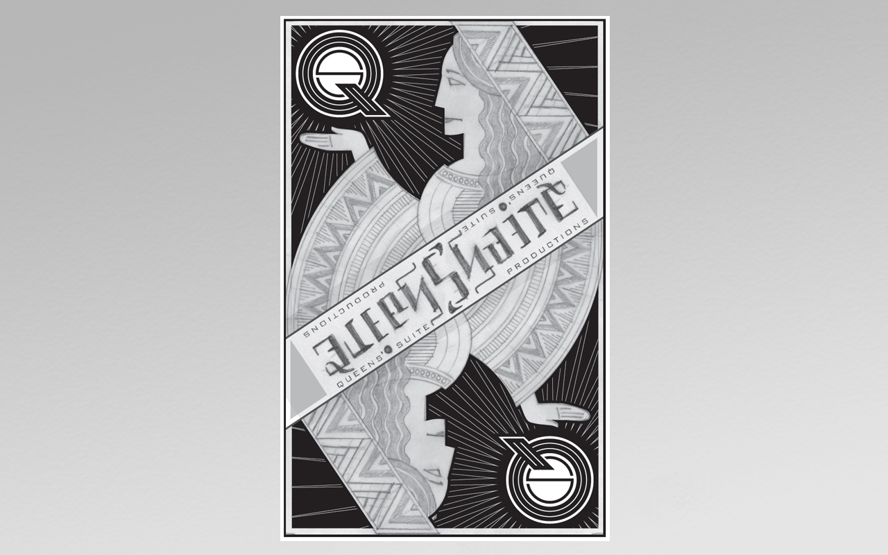
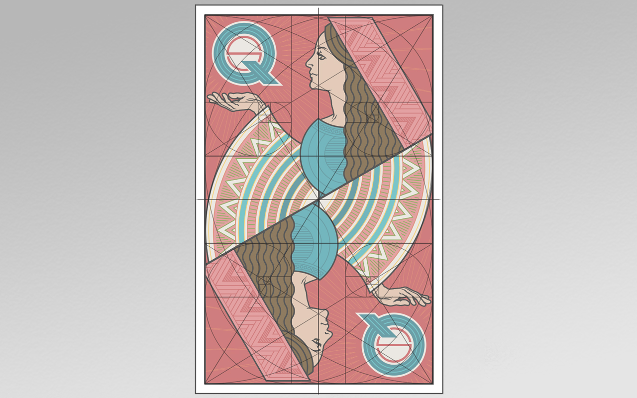
Client interest began to coalesce around a “playing card” concept, perhaps featuring an ambigram logo (though this aspect was eventually scrapped). Client directives at this point also included a request that the figure of the queen be more abstract than naturalistic.
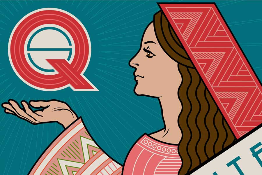
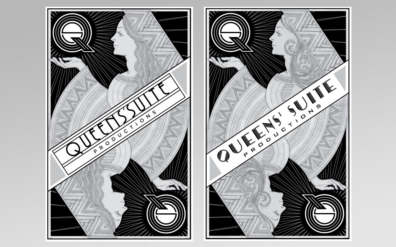
Excitement was building around this concept, but the abstract approach in the previous example was deemed a bit too cold and severe, so I was asked to back off of that a bit and return to a more naturalistic approach for the face and hand. Also, in addition to the more strictly Art Deco interpretation for the hair (left), I offered a more Art Nouveau option (right), along with typographic variations for the primary logotype (which initially included the word “productions”).
The proportional underpinnings of this design were carefully considered from the beginning, based on a grid deliniated by Golden Ratio rectangles and spirals.
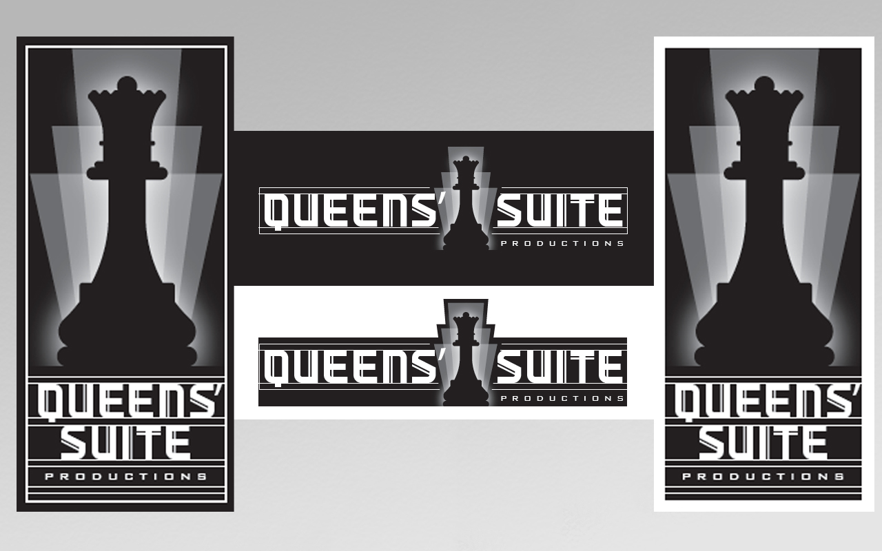
As requested, color variations as well as options with and without the central logotype banner are included in the final suite of production files delivered to the client.